When you add a page, template, or story page to an interface from the Pages Panel (Interface) the Design Selection Dialog will open. This is an overview of the available built-in designs. You can also have custom designs as described in Custom Designs.
Each designed is identified by its scope, navigation method and color scheme.
Scope is used to indicated how refined the design is. The Basic designs have a smaller number of pages and are appropriate for less involved interfaces. The Deluxe designs have more pages and will work well with more intricate and detailed interfaces.
Once you have started using a design, you can customize it without limitation. Thus a Basic design can be turned into a very detailed interface by adding pages, and a Deluxe design can be simplified by removing pages. Thus scope may not be as important as navigation method or color scheme when selecting an interface.
There is currently one built in design where the scope is prefixed by the word Vertical. This indicates that the design is intended for use on phones in portrait mode. While any design can be adapted to different layouts, starting with something that is in approximately the format you intend will simply development.
There are two designations for navigation method - Tabbed and Prev-Next.
Tabbed refers to interfaces that use the Navigation Control (Interface) to move between pages. These interfaces allow the user to navigate between sections of the interface as they choose. While there may be a natural progression from one section to another, the user can bypass that and jump back and forth if they choose.
Prev-Next interfaces have previous and next Button (Interface) that allow the interface to be traversed linearly. This means the user of the interface will need to follow the sequence of screens set out by the interface author. This tends to work best where there are a relatively limited number of pages - it is also the way that Stories work.
Color schemes are described by one or two key colors and sometimes a descriptor such as pastel to indicate the colors are muted. Color schemes are fairly easy to change, and may be a good reason to create and use Custom Designs. If you do that, following the naming conventions outlined here will make it easier to find the Design you want to use.
You can explore designs in their entirety by clicking on the Customize button on the Design Selection Dialog. The design will be opened as a model that you can both explore and edit. If you save that model it will be saved as a Custom Designs, but you do not need to save it to explore it.
The built-in designs all include a model which is connected to most of the graphs, tables, numeric displays and other output devices. The input devices, such as sliders, are not usually connected up. The reason the model is there is primarily to make the thumbnails more representative of appearance. You do not need to keep the starting model, or any model, in custom designs.
Because the deluxe designs often include more than one version of pages, there will be some redundancy/excess in the designs.
Alternatively, you can start a new model, open the interface, click on Get Started in the Pages Panel (Interface) and then on Copy Entire Design into interface in the Design Selection Dialog. This will not bring the model across, so the graphs and other objects will not show results.
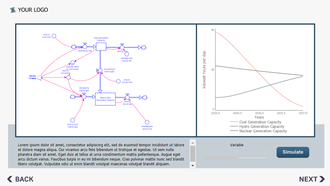
In many respects, the best descriptions of the different built-in designs are simply the pictures that appear in the the Design Selection Dialog. For example, a page showing both model structure and behavior from the Deluxe Prev-Next Blue Green Pastel design appears as:
The color and navigation schemes should be clear from the names of the different designs. The other important characteristics is the number of different types of pages.
There are no hard rules about what types of pages you need to use, either in terms of content or appearance. However, there are some commonly helpful page types that are used in the designs and those are described briefly here.
This is the page that the interface will open on. It is the equivalent of a title page on a book. You can use it to name your interface and provide any credits (authors and so on) you might want as well as calling out version or other pertinent information. Not all interfaces use a landing page, but the can be helpful to welcome and orient the user as well as provide formal information about your work.
The Home page is used to tell the user what the application they will be working with is about, and how to use it. They are instructional. For tab designs they are nice to have in place so users can refer back to them when they have question. For Prev-Next designs they might be annoying, especially is a user is returning to the interface a second time.
An alternative to a sequential home page is a help Button (Interface) that with an Actions (Interface) that the takes the user to the page. One of that navigation options is "Last Visited Page" which will then take the user back to wherever they were.
Background pages provide content related to the subject area of the underlying simulation model. Many include Model View objects that display structure, and can also include graphs or tables the show behavior. You can have a number of background pages, and Storytelling often function like background pages (and also potentially insights pages).
These are pages that display inputs and outputs. If it is mostly inputs we would typically call it a control panel, and mostly outputs a dashboard - but almost all interfaces to both models and physical systems have both. In the Designs that page names reflect which of the two dominate.
These are pages that reflect on the lessons the user has (of at least could have) learned from working with the interface. They are typically text possibly combined with some output from the model runs. Insights can also be delivered using Storytelling.
Not all interfaces will use insights. Their value depends on both the lessons the interface intends to convey and the audience.
Even having articulated all of the different types of interface pages, it is perfectly valid to make a single page interface (or Tabbed navigation interface that looks like a single page). Using designs for this simply select one of the Dashboard or Control Panel pages and build from there.
The following table summarizes the built-in designs available, though some pages could easily fit into different categories:
| Name | Landing Pages | Home Pages | Background Pages | Explore Pages | Dashboard Pages |
Insights Pages |
| Name | Landing Pages | Home Pages | Background Pages | Explore Pages | Dashboard Pages |
Insights Pages |
| Basic Prev-Next Blue Pastel | 1 | 1 | 1 | 4 | ||
| Basic Tabbed Blue | 1 | 1 | 1 | 1 | 1 | |
| Deluxe Prev-Next Blue Green Pastel | 2 | 1 | 1 | 3 | 7 | 2 |
| Deluxe Tabbed Blue Gold | 2 | 2 | 4 | 7 | 3 | |
| Deluxe Tabbed Green Purple | 2 | 5 | 1 | 3 | 7 | 1 |
| Vertical Basic Tabbed Blue | 1 | 1 | 1 | 1 | 1 |